web analytics

2019 Website Design Trends and Your Business

GET MY FREE PROPOSAL

Start. Grow. Scale.

The Ultimate Resource for Your Internet Ambitions Realized

[addtoany]

Watch The Video

Read The Transcript

Introduction:

Hey everybody, it’s Beth Varian here with Webmaster For Hire. How are you doing? We are going to be discussing the website design trends for this year. Normally we do this video back in December, but with all the changes with WordPress and Google and Facebook, oh my, what a crazy year it’s been. Before we go forward, I want to ask if you like the video, please let me know by hitting that thumbs up. Subscribe to the video to catch any new videos that we put out this year. And if you comment below, I’m excited to read them and I’m the one who’s going to be responding. Alrighty. Let’s jump right on in. Today we’re going to be discussing the top website design trends of 2019. We’re going to be discussing the designs that are practical for your business’s online presence. We’re going to discuss the ways to properly integrate the right trends for your target audience.

What are the Website Design Trends for 2019?

Let’s get started. So, what are those design trends for this year? Well, some are similar to last year, but modified and some are completely brand new out of the box. Let’s start with the top one.

GRAPHICS & COLORS

1. Large Images

They are getting larger than they were last year. Last year we were saying, you need to shift away from images that are most definitely stock photography and shift to more natural, real people in the image photos. So that has not gone away, but now the images have gotten larger.

2. Natural, Organic Shapes

And natural organic shapes, you’re going to see circles and squares and triangles. Remember elementary school, they’re coming into play – but they’re going to look very natural. They’re going to be subtle and they’re going to flow with the design. One I should add on is that you’re going to see some more cartoon-like images as well, instead of just the people images.  You’re going to find that they’ll either be modified stock graphics or they’re going to be uniquely designed for that website because they’re going to carry a color scheme throughout the site.

3. Slants & Diagonals

As this slide shows you, it adds a dramatic effect. In addition to adding drama to the site’s design, the diagonals’ points are going to guide the eyes of your visitor down to important areas making sure that they keep a nice flow. I should say the horizontal sections, they’re still around – but they’re going to start fading out. By 2020, you’re going to see less and less of those horizontals. There’s a heads up for you for next year. The slants and diagonals are starting to lead that way of keeping a very consistent long scroll that looks like it’s all one and is meant to be consistently together.

4. Flat Images Appearing 3-D

This is going to be for both the product industry, as well as, service and hospitality because we’re going to be creating more of that virtual website appeal without having actual VR. I still have my goggles; I hardly ever use them.

5. Vibrant, Saturated Color Schemes

Those bright, brilliant colors are not going away. In fact, they’ve gotten bolder. You’re seeing more fuchsias, more neon oranges and more brilliant bright colors. But look at this next one. It absolutely is the absolute opposite of what I just said.

6. Minimalism

The vibrant colors are one, but minimalism is coming strongly – which is kind of funny because it’s minimalism, not so strong.
Minimalism is being wonderfully used and executed for creative businesses. We have a client that does oil and watercolor [art]. We launched his black and white site where the only color on the site was his work. It made his work really pop well.

Let’s get onto my other favorite topic.

FONTS

I am still a font freak. Let’s talk about those beautiful fonts.

7. Larger Typography

They’re going more contemporary, more modern appeal and bigger. Everything is bigger. So, the internet is turning into Texas.

We use the Lato font here and this little black pop out is from WhatFont extension. If you’re interested in it, you can look it up here. You can see we’ve increased the body font size. Last year, we were telling you take those 14- and 12-pixel fonts and make them bigger. Now we’re telling you not 16- and 18- pixels, but look, ours is 20. I’ve seen up to 28-pixel font. You have to be careful of the font family because this font as a 30 would be too big. But some of the smaller fonts that already come in looking a little smaller, they can go much larger – especially if they’ve got some “curly-q’s” to it. It makes it more readable, but bigger fonts for certain.

The reason for the large images and the large fonts is our phones. Look this is my head, and it’s [the phone] getting bigger. This is the S9+Galaxy, and the S10 I’m told is just a little bigger and I-Phones – you guys are catching up with us in size as well. As those get bigger, the fonts get bigger, and the images get bigger. It makes it easier to read in the screens, but it’s still beautiful even on desktop.

8. Vintage Typography

We haven’t seen vintage typography popping in web design since, I don’t know, the 90s. I think that was the last time I saw it, but it is coming back. Retro is in, I don’t know if this is going to be a trend that’s going to stay around or if it’s just the trend for the year. We’re going to have to watch that and see how it’s done. The right businesses can get away with it. I don’t know that I would utilize this for a medical, legal or financial business [website]. Medical – we could if that went with the flow of the theme of the medical practice, maybe. Typically, this would be something that I would use for more of a fun business site.

Image Credit: Neil Patel

9. Serif Fonts

And then just like in design, we have opposites for trend in fonts. So, we have the vintage, which has more “curly q’s”, more strokes, and more added ornaments into the font to now – the Serif fonts. We grabbed this image, just to give credit where credit is due, from Neil Patel’s site. If you’ve been in the marketing world for any time at all, you will have heard of Neil Patel. If you haven’t, I recommend you go check him out.

But this beautifully shows, even though you’ve got some little hooks and crooks there, it’s still evenly spaced. It’s very nice and plain and they are beautiful when you go wider. And again, it lends itself to more the contemporary modern. Again, is opposite of the vintage. The vintage isn’t going to be for everybody.

BEYOND DESIGN BUT INCLUDED IN DESIGN – MOVEMENT

Before we move forward … we got one more. This one kind of starts putting a toe into development, not into design. However, if you’re going to be starting from a design standpoint, the very first thing a customer tells you is, “I want that ultimate wow factor.” What’s that famous line? Right? We all have heard it. Well, “movement” is what they’re talking about many times that they want that “wow”.  If you’re giving them a flat image [design phase], you can always just stipulate “this will be doing this once we get to the development phase. You’ll be able to see it best.”

10. Purposeful Animation

So, purposeful animation is definitely popping up. We don’t want the “wow” factor to be Bam, Bam, Bam, Bam, Bam and freak out the brain and the eyes and people bounce out. Because anyone in marketing knows, “bounce” is not our favorite word.

videos

11. Videos

Videos are also coming up now.  Well, they’ve been around and they’re not going away. And I should put on there [slide], but I didn’t want to get all the designers angry and up in arms so soon (smile). But I should put in there, parallax is not going away yet [either]. Sorry. But it can still be done tastefully. It doesn’t have to be all over the place – every other horizontal space – and again, we’re going more all one consistent look. So, you can do it right.

EXAMPLES

Alrighty, let me get you some examples so you know exactly what I’m talking about here.

Webmaster For Hire
Click Image to Visit Site

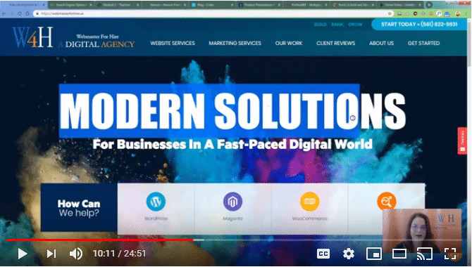
This is my site. This is Webmaster For Hire’s website. It is the same site that we had in late 2017. So, you probably saw this last year. We have made some tweaks to it. We already had gone with the large images or fonts for the style. And as you can tell, we embraced the bold colors. We still currently have the horizontal spacing.  But like I said, going into 2020, that’s going to change and we’re already starting on the new design.

The lower pages, this is where we made more changes. We increased the body font and we got rid of this [??]. We added the feature image instead of just having a small image there [header area] or just the text. We have the large images here [in the body] and then we got rid of all the little images throughout the body text.  We added either one or two large images to break up that text to make it easier to read. And especially since Google now says really long blog posts are going to get their attention [images are nice]. (Side note: if you haven’t paid attention in March, the algorithm Florida -since I’m in Florida, I love the name and I’m glad it’s not an animal again – that rolled out. You really want to pay attention to it regarding content. That’s not discussing design, we’ll discuss that another day.)

Okay. So, this year, instead of going and grabbing websites, I went and grabbed a bunch of themes from ThemeForest.  I left the location bar in case you like one of these themes, you can tell your designer or if you are a designer that uses themes, you’ll know where to go and exactly which one it is.

Click Image to Visit Site

This is a Codex theme. This is The Gem and the demo called “Medical”. This one does beautifully with color and the diagonals. You see the brilliant blue color.  This shows that it doesn’t mean it has to be the fuchsias everywhere – but they did tie in the fuchsia color. Look how that diagonal brings your eye down. Look how consistent this looks, how large the images of the people appear. You kind of feel like you’re almost next to him. Not quite that large, but large enough. This font I would definitely increase. You can see the difference in readability from the larger fonts. Some designers prefer a smaller font, but if you’re going to be focused on keeping with the trends and keeping with mobile – you really want to increase your fonts. Here’s the extension I was telling you about. Let’s grab it and I’ll show you. This is a Sans font – Source Sans Pro, but it’s a 16-pixel font. That’s what we were telling you to do last year. I would bump this up and with that font I would probably go to a 20. Even on the homepage, you really want to start grabbing those larger fonts.

We’ve got some movement – that’s been around for a long time with the rolling numbers. You can see the beautiful colors, but look here, they’re tying in the beautiful colors back with the white space. I’m a designer that loves white space. It doesn’t mean that it’s for everybody or every business, but I love it because it’s nice and clean. Then we bring in the diagonals, again, at the bottom with the pops of color as you can see. They still have their separated spaces, but they’ve done it beautifully by using those angles and diagonals and points.

Click Image to Visit Site

Now we’re going to go a little bit opposite. We’re going to show you the organic shapes and this is minimalist with pop of color.  So, it really ties in, and I love this theme.  There are a couple of web marketers out there that are using designs very simple or similar to this.

And I know Neil Patel keeps his kind of like this as well. I was trying to think of what the other one was called, something Grain. Sorry guys. I don’t remember their name right now. (UPDATE: Single Grain is the company) But anyway, so if you look, we’ve got the shapes added in, we’ve got the pops of color, you’ve got still some of the hovering going on. That’s not going to go away. But we’re bringing this circle in the background subtly, organically down and tying it in with the photos. So, it’s beautifully well done, minimalist style, but it’s adding in the shapes. It’s not using the blocks of horizontal sections and it’s still giving a beautiful appeal and getting your attention. And again, you’re seeing that the organic shapes are just really flowing down. It is leaning towards minimalist, but it’s not boring minimalist in my opinion. And, of course, design is subjective.

Click Image to Visit Site

This is minimalist. Minimalism at its finest, and I have to tell you, I really think it was executed well. Now this will definitely be for more of a blogger site and (well, I’m on the blog page) this is Crate. I’m not telling you all of them, but you can see them up in the top. I’m going to put them all (these links) in the body content on our website where we embed this video.  Because we’ll also have this as audio and because this is a very visual topic, we need to get our audio listeners some links to go see what the heck we’re talking about. But you can see the black and white is just beautiful even with the images. But if those images – see here with her glasses, she has a pop of color and it draws the attention in, not boring. Again, design is subjective.

Click Image to Visit Site

Okay, this one, I love this one. It not only shows the large images, flat images as 3-D, it’s minimalist with a pop of color and you got those beautiful diagonals in there. Talk about the ultimate theme that shows all the trends in one, you can see really the details of the product.  And you’ve got the diagonals that breaks up the section, but it keeps the focus where it needs to be – it’s on these headphones.  Having the attention on that product is perfect. It’s what we’re here to do – to promote our products [and] services. If you’re a blogger or seeking to be an influencer, you’re promoting for ads. Showcasing the very thing that you’re trying to focus on is done impeccably with the large images in this case. I can see the material.  I can feel and get an idea of that cushioning on the headphones. I can feel like I could put it over my head, even though it’s on my computer. The smaller images just never gave this much dimension.

And then not to be leaving anything out, they even add in some beautiful, slight subtle movement here on the headphones themselves. So, they’re still spotlighting the proper product focus, but they’re adding some movement to give a little bit of that “wow” factor. Then if you go down, you can see they’re showing the headphones in various positions. And then look right there, *BAM*: pop of color, 3-D image, large font and still minimalist background. You don’t get better than showcasing the trends than this theme.

Click Image to Visit Site

Let’s talk about some of the movement now.  This is a political site and I could care less about the politics side. I don’t care what country you are in, I’m kind of over it at this point. But the zooming in on the image (that’s all that is) but it gives it what a lot of business owners are wanting. That bit of a “wow” factor that doesn’t load the code on the site.

Every builder out there has this feature. Your, well, it’s not visual composer anymore – it’s the WPBakery, Elementor, and the Divi theme builder. Almost all of them allow the hovering, or the zoom in on the image. It’s subtle. It doesn’t take away from those beautiful big fonts in the slide. And if you scroll down, they added video right there. Video on the homepage, I am definitely not against.  Video, they say one photo is worth a thousand words. Well images give you the thousand words and gives you more of the speaker’s inflections, more of the concept of the owners and inflections versus you trying to put your own and believing, “I think they mean this.”  And if you can’t tell, I am all about being “perfectly imperfect.”  This is not an edited video. It’s a one-shot video that I’m creating today. I leave my flaws in.  That’s a video for another day because that truly is the “Oprah effect” of being relatable.

Again, I would take this font a little bigger and then when you come down here, you still have the sliding images for the logos. I don’t see those as often these days. They’re only really good for [when] you want to showcase a massive amount of images without looking too cluttered. Okay.

Click Image to Visit Site

This next one that I’m going to show you, what they did here, I would not recommend [it] for every business site out there. It can definitely be a little bit too much “wow”. I came here to showcase [it] because they were using brilliant colors in their themes. But this page that shows off all the demo options actually had a very beautifully executed movement on a page. It’s going to be more than what most websites should be doing. In this case, it’s a creative site. It’s showcasing their creative abilities, it’s absolutely perfect.

You know I like that background because it absolutely mimics mine. So of course, I’m going to like it. But watch the movement as I scroll down, we’re going to go off the slider, off the page, bringing in all the elements, sliding them in timely and then down. And when we get down, we see they’re brilliant colors that very vibrant colors that are being used. Now obviously if you buy the theme, you don’t want to use their images. And there it is – there’s parallax. Business owners still love this. And if you’re a business owner wondering why I’m laughing about this, it’s because every time I talk about parallax, somebody inevitably sends me an inbox message or makes a comment, “please tell parallax to go away.”  Parallax just is of an image that looks like it’s in the background and the site’s going over it, if you’re not familiar. But it can be used in a very nice way, but it’s not every other section now. We can use it in one spot for that pop of “wow.” Now watch as everything moves away. Bye bye, and here we go.

So that’s a little bit more than you would do on most business websites, but for a creative website, if you’re a designer and you’re loving that, go for it.

Click Image to Visit Site

And the very last but not least, there is video. Now I want to show you, and I purposely didn’t put it up here just so you can see one of the problems with videos – but one that was used, actually pretty well if you ask me. Let’s see. Answer the Public. If you’re in marketing or if you’re a business owner that likes to write your own blog posts, you need to know this site. It’s wonderful for getting content ideas. So, it has a longer page. It doesn’t necessarily need it – they are doing their coverage book courses. But this video, this guy’s going to get annoyed with me. He’s going to start cussing me out here in a minute. What he wants me to do is get down here and fill in the box for the keyword that I’m trying to write [about].

See there he goes, cussing me out. While I was talking though, after I typed in the domain name, what you may have noticed is it took a little bit to come down.  Because I visit this site, the video is cached. If I’m new to this site, it’s a slower download. It’s perfect for this site. I don’t know if I’d have a guy cussing out my visitors all the time. I don’t know if he’s cussing, but he’s not too thrilled with me. But it is to add that bit of a “wow” factor. In fact, the first time I saw it, I’m like, “oh, what’s he doing?”

So those are themes that cover all the website design trends for 2019.

Watch Part Two

Continue watching. Part 2 can be viewed here.

Ready To Discuss Your Project?

Schedule time to connect and discuss your specific needs.